App Inventor Chart Components: Project Summary
In the last post, I have thoroughly covered the implemented Pie Chart type for the App Inventor Chart components project that I have been working on. This post, we will take a look at the final features implemented as part of the project – the Bar Chart type, and Chart customization options.
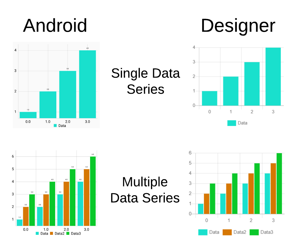
The implemented Bar Chart type look as follows in the Designer and Android:
In terms of the Bar Chart data, there are quite a few ways to represent the data. However, since the Bar Chart has both an x and a y axis, some consistency with the other axis based Charts would be desired.
In essence, the Bar Chart data entries consist of numeric x and y values, much like the point-based (Line, Scatter and Area) Charts that we have seen before. The difference, however, lies in the x values. Since it does not make much sense to have decimal x values for the Bar Chart’s entries (since bars would then overlap), instead, x values are treated as integers. In addition, to simplify the case a bit, the x values are restrained to be non-negative values starting from 0.
To put it in perspective, the x value is then treated as if it were an index. The Bar Data Series could be thought of as a List of entries, where the x value corresponds directly to the index.
The code snippet below shows the implementation of retrieving an entry from a tuple:
  public Entry getEntryFromTuple(YailList tuple) {
    try {
      // Tuple is expected to have at least 2 entries.
      // The first entry is assumed to be the x value, and
      // the second is assumed to be the y value.
      String xValue = tuple.getString(0);
      String yValue = tuple.getString(1);

      try {
        // Attempt to parse the x and y value String representations.
        // Since the Bar Chart uses x entries as an index (so an
        // x value of 3 would correspond to the 4th entry [3rd index],
        // the float value has to be floored.
        int x = (int)Math.floor(Float.parseFloat(xValue));
        float y = Float.parseFloat(yValue);

        return new BarEntry(x, y);
      } catch (NumberFormatException e) {
        // Nothing happens: Do not add entry on NumberFormatException
      }
    } catch (Exception e) {
      // 2-tuples are invalid when null entries are present, or if
      // the number of entries is not sufficient to form a pair.
      // TODO: Show toast error notification
    }

    return null;
  }
Here, the difference from Point-based Charts is in the x value – the value is floored to retrieve whole numbers (integers).
So far, we have established that the x value directly corresponds to the index of the entry in the Data Series. This is one of the properties that we define and make sure to ensure for the data entries of the Bar entries.
The second property that we define (and which directly follows from the index property) is that the x values of the entries are sorted in ascending order, where the difference between two neighboring x values is at most 1. This means that x values strictly follow the order:
0, 1, 2, 3, ..., NThe reason for defining these concepts is partly due to the MPAndroidChart’s underlying Bar Chart grouping implementation. Since grouping bars where gaps exist (e.g. the x value of 0 and an x value of 4 exists, but no other entries) puts them next to each other, the empty gaps have to be filled to implement multiple Data Series support for the Bar Chart.
With the properties of the Bar Chart entries defined, the methods which handle adding and removing entries must ensure that the Bar Data Series is left in a consistent state satisfying both properties. Due to this reason, the methods require extra logic.
Let’s start from the removeEntry method, which is simpler than adding entries:
  public void removeEntry(int index) {
    // Entry exists; remove it
    if (index >= 0) {
      // If the index of the Entry to remove is the last Entry,
      // we can simply remove the Entry from the Data Series' values.
      if (index == entries.size() - 1) {
        entries.remove(index);
      } else {
        // If the Entry to be removed is not the last Entry, we
        // have to instead set the Y value of the Entry to be
        // removed to 0 in order to preserve the Bar Chart Data
        // properties (x values sorted and correspond to indexes)
        entries.get(index).setY(0f);
      }
    }
  }
The remove method already assumes that the index is not out of bounds (provided it is not negative), and then handles two cases.
The first case is where the index of the entry to remove is thee last entry of the Data Series. In such a case, the entry is simply removed from the Data Series.
The second case is where the entry is not the last in the Data Series. In that case, the entry’s y value is simply zeroed out, creating a gap between bars.
After deletion, we are left with a consistent state again, since no entries are actually removed, unless it is the last entry.
The method responsible for adding entries is a bit more complex:
  public void addEntryFromTuple(YailList tuple) {
    // Construct a Bar Entry from the provided tuple
    BarEntry entry = (BarEntry) getEntryFromTuple(tuple); // safe cast

    // If entry constructed successfully, add it to the Data Series
    if (entry != null) {
      // Since Bar Chart entries use x values as indexes (which
      // are integers), we need to cast the entry's x value to an integer.
      int xValue = (int)entry.getX();

      // To ensure the two properties of the Bar Chart entries
      // (one of which is the property where entries are sorted
      // in ascending order by x values, where the difference between
      // subsequent x values is always 1, and the other which is
      // that x values correspond to an index), we need additional
      // logic for entry insertion.

      // Negative x value is an invalid input (negative index);
      // Skip entry adding.
      if (xValue < 0) {
        return;
      }

      // X Value is less than the entry count of the Data Series;
      // This means that the value already exists
      if (xValue < entries.size()) {
        // Use x value as index and update the entry in that position
        entries.set(xValue, entry);
      } else {
        // To ensure that the x value would correspond to
        // the index, missing values up until the x value
        // need to be filled (with 0 values)
        while (entries.size() < xValue) {
          entries.add(new BarEntry(entries.size(), 0));
        }

        // Add the entry to the Data Series; Since we
        // took care of missing values, this will now guarantee
        // that the x value corresponds to the last index of
        // the Data Series (equal to entryCount - 1)
        entries.add(entry);
      }
    }
  }
Initially, the entry’s x value is checked. If the x value is negative, the entry is simply not added, since we restrained the values to be of positive x values.
If the x value is less than the entries size (meaning that the entry exists), the y value of the entry is simply updated (since we treat the x value as an index, and thus we do not allow duplicates)
Otherwise, if the entry does not yet exist, first empty (zero) values are filled until the entries size becomes equal to the x index. In that case, adding the entry results in the x value being equal to the entries size, and the entries size being 1 larger than the x value. This essentially ensures that the added value’s x value corresponds directly to the index.
With this implementation in mind, we successfully satisfy our defined properties.
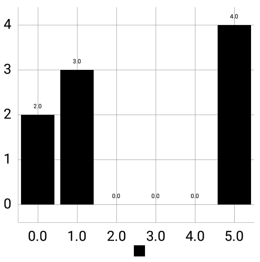
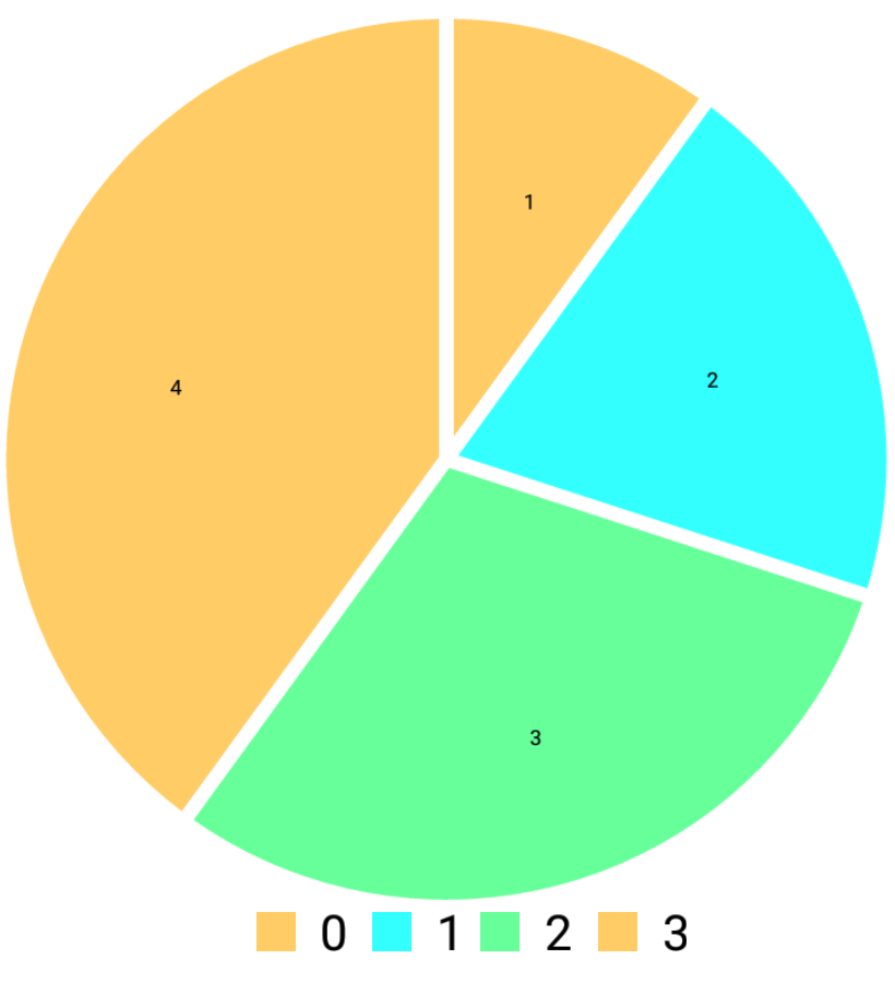
The following image demonstrates the created gaps in the Bar Chart to better illustrate the idea:
With regards to the Bar Chart view itself, the implementation is very similar to that of previous Chart view implementations, and behaves very similarly to the Line, Area and Scatter Chart implementations.
However, one important part that has to be taken care of is the grouping of bars. Since the Bar Chart may support multiple data series, the bar grouping methods have to be applied, and some calculations have to be made.
Firstly, it is important to note that whenever we add an additional Data Series, the bars are fitted into a grid of x granularity 1. What this means is that the space between subsequent x values is constant. Due to this reason, the Bars of the Bar Chart have to be decreased as the number of Data Series increases.
Since the number of Data Series currently only changes whenever a Chart Data Model is created (which also links the created Data Series to the Chart), we may recalculate the necessary properties upon this method call:
  @Override
  public ChartDataModel createChartModel() {
    // Instantiate a new Bar Chart Data Model with the local
    // BarData object.
    BarChartDataModel model = new BarChartDataModel(data);

    // Since the creation a new Bar Chart Data model implies
    // an addition of an additional Data Series, the Bar Space
    // and Width variables have to be recalculated.
    recalculateBarSpaceAndWidth();

    // Return the instantiated model
    return model;
  }
The method for recalculation is implemented as follows:
  // Constant for the spacing to apply to groups of bars
  private static final float GROUP_SPACE = 0.08f;

  // Local variables to keep track of the current Bar Space and Width.
  private float barSpace = 0f;
  private float barWidth = 0.3f;


  /**
   * Recalculates the Bar Space and Width of the Bar Chart based on
   * the current number of Data Series attached to the Bar Chart.
   * In the case of only a single Data Series being attached to
   * the Bar Chart, no recalculations are performed.
   */
  private void recalculateBarSpaceAndWidth() {
    // Get the current number of Data Sets
    int dataSetCount = chart.getData().getDataSetCount();

    // If there is more than a single Data Set, the Bar Space and Width
    // have to be recalculated.
    if (dataSetCount > 1) {
      // (BarWidth + BarSpace) * #datasets + groupSpace should equal 1
      // to fit into the x axis grid of the Chart (of granularity 1).
      // The 1f here represents the fixed granularity of the X axis.
      // Since the number of data sets can change, the bar space and
      // bar width should be re-calculated. 10% and 90% of the remainder
      // are given to the Bar Space and the Bar Width, respectively.
      float x = (1f - GROUP_SPACE)/dataSetCount;
      barSpace = x * 0.1f;
      barWidth = x * 0.9f;

      // Update the bar width of the Bar Chart
      chart.getData().setBarWidth(barWidth);
    }
  }
First of all, we check whether the Chart has more than one Data Series. If that is not the case, then we do not need to perform the calculations since this only applies to Bar Charts with multiple Data Series.
Otherwise, we then have to recalculate the bar space and width. A decision was made to keep the group space constant for consistency and simplicity.
Since we must fit into the granularity (which we define to be 1), the following equation must be satisfied: $$ (BarWidth + BarSpace) * \text{#datasets} + groupSpace = 1 $$
The explanation behind this equation is that a single Data Set (Series) takes up \(BarWidth + BarSpace\) space, which is to be represented as a fraction (value is no bigger than 1). For this reason, we multiply this number by the number of Data Series in the Chart. Additionally, we add the group space, since this is added at the end of the bars.
From this equation, we can derive the sum of the Bar Width and Bar Space: $$ BarWidth + BarSpace = \frac{(1 - groupSpace)}{\text{#datasets}} $$
From this, it is entirely up to us how we would like to distribute the Bar width and space. I have personally found a 90% for the width and 10% for the space to work really well. Therefore, we can replace the equation as follows: $$ 0.9x + 0.1x = \frac{(1 - groupSpace)}{\text{#datasets}} $$
We then have an equation with a single unknown (the x value), which we calculate, and from which we then derive the Bar Space and Bar Width parameters. We then set the Bar Width accordingly.
Whenever we refresh the Chart, we should also regroup the bars to match the newly added entries. The method which handles this is shown below:
  // Constant for the starting value to group Bar Chart bars from
  private static final float START_X_VALUE = 0f;

  /**
   * Regroups the Bars of the Bar Chart, while also re-calculating the
   * maximum X axis value to fit all the bars. If there is only a
   * single Data Series in the Bar Chart, no action is taken.
   */
  private void regroupBars() {
    int dataSetCount = chart.getData().getDataSetCount();

    // If there is more than one Data Set in the Bar Chart, the
    // bars have to be regrouped.
    if (dataSetCount > 1) {
      // Group Bar Chart bars with the current parameters
      chart.groupBars(START_X_VALUE, GROUP_SPACE, barSpace);

      // Determine the maximum number of entries between Bar Data Sets.
      // This value is needed to apply the maximum value of the axis.
      int maxEntries = 0;

      for (IBarDataSet dataSet : chart.getData().getDataSets()) {
        maxEntries = Math.max(maxEntries, dataSet.getEntryCount());
      }

      chart.getXAxis().setAxisMinimum(START_X_VALUE); // Update the x axis to start from the start x value

      // Set the maximum value for the x axis based on maximum entries and the group
      // width of the grouped bars. The calculation is based directly on the example
      // presented in the MPAndroidChart library example activities.
      chart.getXAxis().setAxisMaximum(START_X_VALUE +
          chart.getData().getGroupWidth(GROUP_SPACE, barSpace) * maxEntries);
    }
  }
In the method, we again check whether the Chart has more than one Data Series. If that is the case, we can then group the Bars (otherwise, we do not need to).
Firstly, the Chart’s bars are grouped with a fixed Start X Value, meaning that the bars will begin from the specified x value, which was defined to be 0 (the minimum possible value of the Bar Chart entries). The constant GROUP SPACE that we have defined earlier is also used as a parameter, as well as the calculated space between the bars.
The second part of the method takes care of setting the maximum x value of the axis for the Bar Chart to ensure that all bars are visible.
The calculation for the maximum x value is as follows: $$ maxXValue = \text{START_X_VALUE} + \text{groupWidth(GROUP_SPACE, barSpace)} * maxEntries $$
The reasoning behind this calculation is that we first take the starting x value of the group, and add the space taken up by all the grouped Data Series. The groupWidth function determines the space taken up by a single group (a group is a set of bars covering one x value and holding all the bars for all the Data Series in the Bar Chart).
The reason we multiply by the maxEntries value is to fit all the bars on the Chart view. For instance, consider a Bar Chart with 3 data series, where the first one has 3 entries, the second one has 2 entries, and the third one has 5 entries. We have to multiply by 5 in order to fit the last entries of the third Data Series. While we do satisfy the index property, this does not mean that every Data Series has an equal amount of entries, therefore we require to find the maximum entries count.
This solution was taken directly from the solution used in the MPAndroidChart library example, and applies to all cases, no matter the group width, the maximum entries or the starting x value.
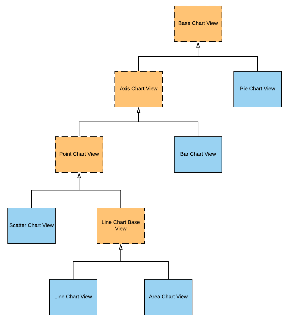
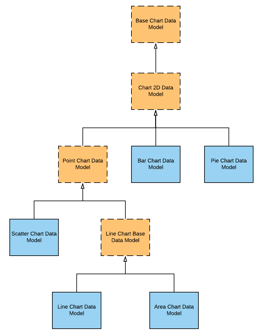
As we have implemented all of the Chart types that were planned to be implemented, it also made sense to make some minor refactoring to the hierarchies of the Views and Models. The hierarchies were refactored to be slightly different to group some properties together. For instance, Charts with axes share quite a bit of common functionality and grouping, so it made sense to create an abstraction there.
The final features that wrapped up the end of the project were some customization options that allowed to personalize the Charts a bit more. The customization is still at a relatively early stage, and far more possibilities can be implemented in the future, but I handpicked some properties which I thought would be quite nice to have.
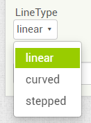
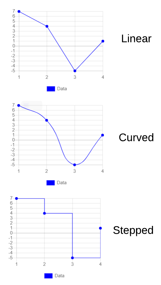
The Line Type property defines the drawing type of the Lines for Line based Charts. The property is only accessible via the Designer properties, and is shown only when the Chart’s type is Line or Area. The property can be applied to individual Data components to have Data Series with varying line styles.
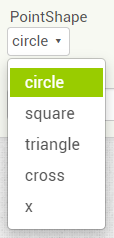
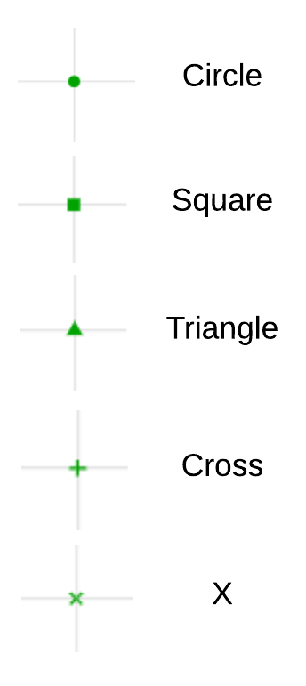
The Point Shape property defines the shape of the points used by Scatter Charts. The property is again only accessible via the Designer properties, and shown only when the Chart’s type is set to Scatter. While this would seem like a natural option to implement for the Line Charts as well, unfortunately MPAndroidChart does not support the feature yet, so it was limited to Scatter Charts. The property can be applied to individual Data components to have Data Series with varying data point styles.
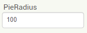
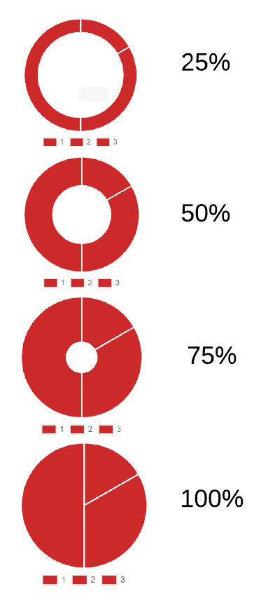
A property specific to the Pie Charts (which was also mentioned in the Pie Charts post) is the Pie Radius property. This property defines the percentage that the actual Pie Chart should take. The lower the percentage, the hollower the Pie Chart. The property is applied to the Chart component itself.
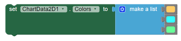
In addition to the existing Color property, the Colors property setter and getter blocks were added. These blocks allow setting multiple colors to a Chart Data Series, which is especially useful for the case of Pie and Bar Charts. The block takes in a List of Colors as input, and if there are more entries than colors, the colors are simply alternated in order.
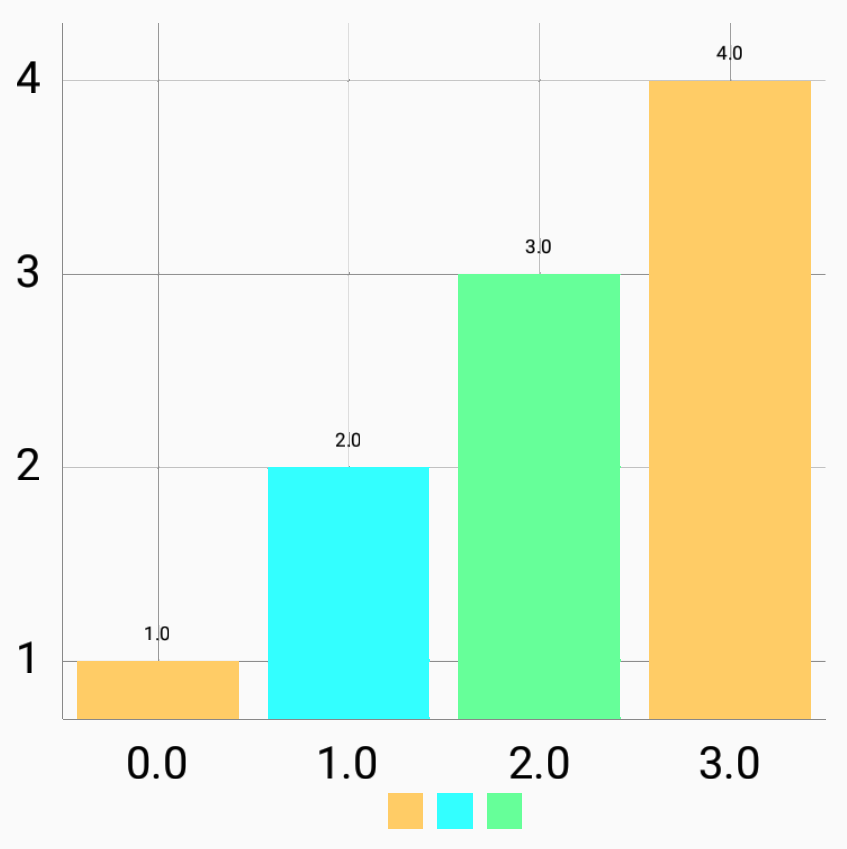
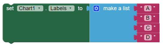
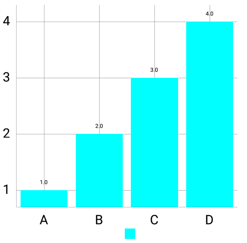
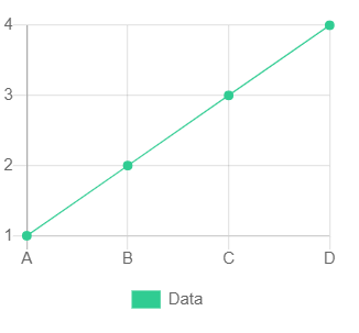
A property that I also figured to be very important is the Labels property, which allows setting custom labels to the X axis. For instance, imagine a Bar Chart where the x values are labelled 0, 1 and 2, but in reality, the data plotted in the Bar Charts actually represents some statistics, where each x value represents the statistic. In that case, the Labels property can be used to specify the custom labels. See the example below:
The way the Labels property works is shown in the code snippet:
  // List containing Strings to use for the X Axis of the Axis Chart.
  // The first entry corresponds to an x value of 0, the second to
  // an x value of 1, and so on.
  private List<String> axisLabels = new ArrayList<String>();

  @Override
  protected void initializeDefaultSettings() {
    // ...

    // Set custom value formatter for the X Axis to display custom
    // labels, if they are present.
    chart.getXAxis().setValueFormatter(new ValueFormatter() {
      @Override
      public String getFormattedValue(float value) {
        // Round the float value to an integer
        int integerValue = Math.round(value);

        // Using the integer as an index (non-negative), check
        // whether the axis labels List is in range for the index
        if (integerValue >= 0 && integerValue < axisLabels.size()) {
          // The Axis Labels has an entry in the index; Use the
          // custom label as the x axis label
          return axisLabels.get(integerValue);
        } else {
          // Custom axis label not present; Use the usual value
          return super.getFormattedValue(value);
        }
      }
    });
  }
The value of the x axis is first rounded to the nearest integer. If the integer value is within bounds of the custom Labels List, then that Label is used instead of the raw value. Otherwise, the usual value is used without applying any custom label.
An important thing to note is that since the Pie Chart does not have any axis whatsoever, the property only applies to axis-based Charts.
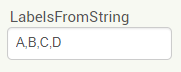
Additionally, the Labels property may be set via the LabelsFromString Designer property. This property takes in a String formatted in CSV, and applies the Labels in order. The first CSV parsed value corresponds to the x value of 0, the second to the x value of 1, and so on.
A few more properties were added, including:
For the curious readers, the pull requests related to the Bar Chart and Chart Customization can be found here:
This has been the last post covering the features implemented during the project. A final post will follow very soon summarizing the project.
Stay tuned!
Overview In the last post, I have thoroughly covered the implemented Pie Chart type for the App Inventor Chart components project that I have been working on...
Overview Last post, I have wrapped up the implemented methods for importing data to the Charts for the App Inventor Charts project that I have been working o...
Overview In the previous post on the App Inventor Chart Components project, I have covered data importing from Files, as well as from the Web. Previously, we...
Overview In the previous post on the App Inventor Chart Components project, we have looked at an extensive description of Chart Data Source concepts and real...
Overview It has been a while since the last post due to a highly busy period! A lot of blog posts were postponed, but now a series of posts will follow in th...
Overview Following up on the App Inventor Chart components project, this blog post will focus on a specific workflow aspect that allows to select the Chart t...
Overview With the workflow for the App Inventor Chart components established, the next step is to define the concepts and format of the Data that can be impo...
Problem While working with Charts in Android using the MPAndroidChart library, one inconsistency that I stumbled upon is the fact that all the Charts support...
Overview In the last post, I have previewed the workflow of the Charts components that I am working on for App Inventor. In this post, I will dive into some ...
Overview Following up on the Chart prototypes, this post will focus on previewing the current progress on the Charts components in App Inventor.
Overview In continuation to the previous previous blog post, this post will focus on a Line Chart Component prototype in App Inventor.
Overview During the initial steps of the project to develop Chart Components for App Inventor, the major focus was on the design of the components such that ...
As the community bonding period is nearing to an end and the coding period is about to begin, I would like give a status update on what happened in the last ...
Introduction I am Evaldas Latoškinas, currently a first year Computer Science & Engineering international student in the Netherlands at TU Delft. Origina...